After nearly a decade, Google is giving its iconic “G” logo a fresh new look swapping its classic four-color segments for a fluid rainbow gradient. First introduced in 2015 alongside the switch to Product Sans font, the segmented “G” has become one of tech’s most recognizable symbols. Now, the refreshed version smoothly blends red, yellow, green, and blue into a continuous gradient, echoing the aesthetic of Google’s Gemini AI branding.
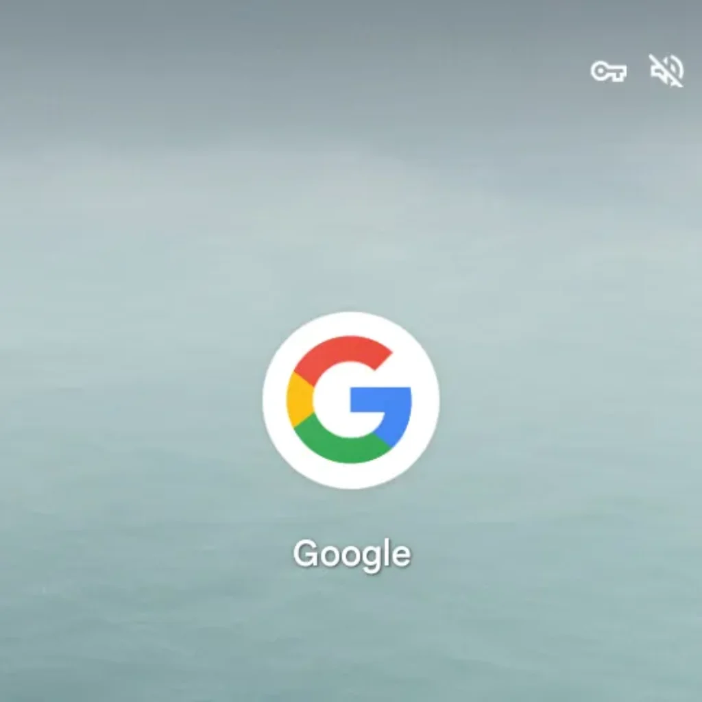
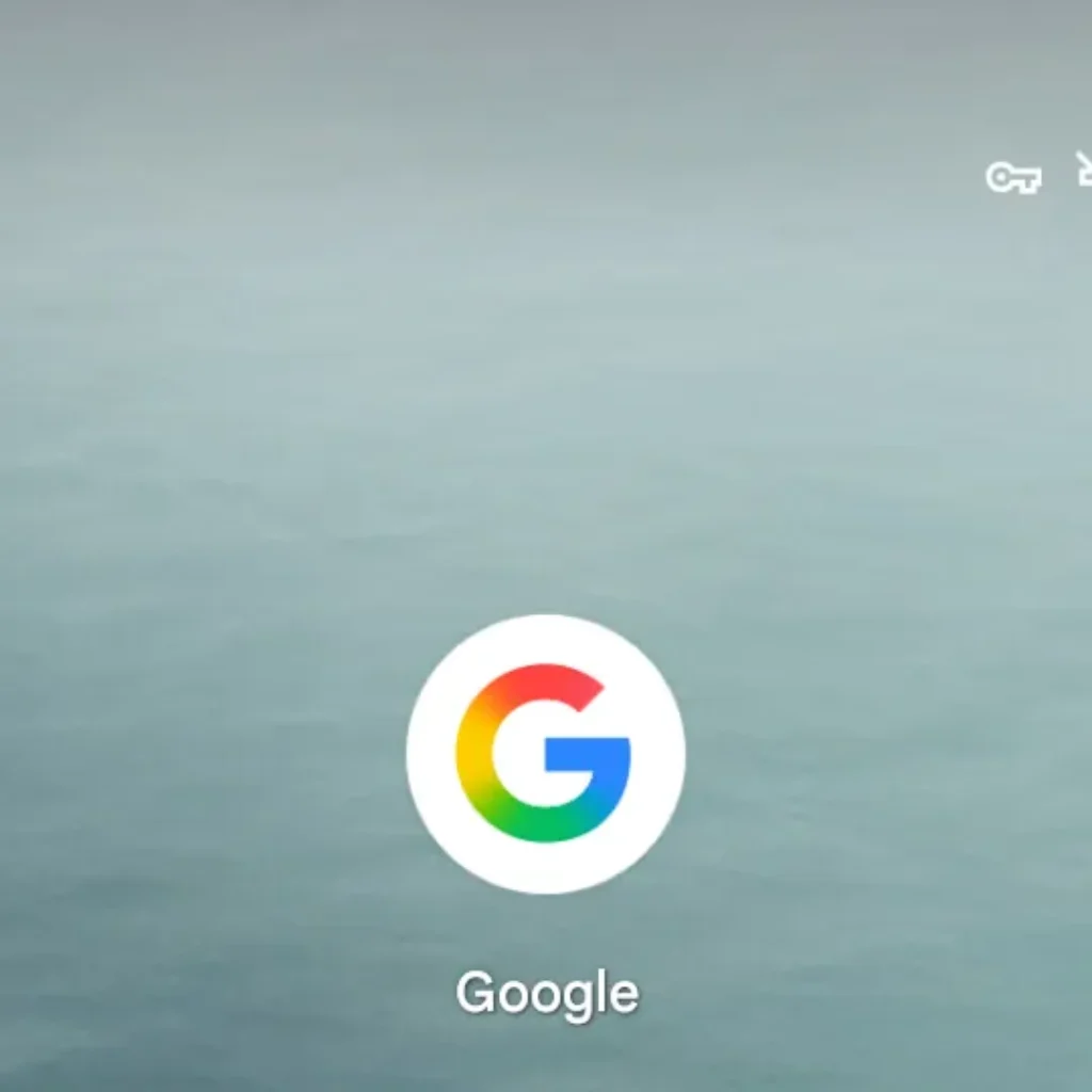
The updated logo has started appearing in the Google Search app on iOS and Pixel phones, with Android Authority confirming its rollout on Android as well. For now, other platforms like the web and non-Pixel Android devices still show the original segmented version, but this shift hints at a broader, modernized visual identity in the works.
Interestingly, Google’s main six-letter wordmark remains untouched, though the gradual logo modernization could eventually extend to other four-color icons like Chrome, Maps, or Assistant. Subtle or not, it marks the end of a familiar decade-long era.

